in this lesson


What is a UMAP?
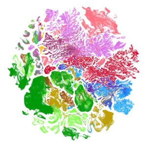
This is a special type of graph, called a Uniform Manifold Approximation and Projection (UMAP). UMAPs are helpful ways of displaying many types of data and are often referred to as one type of dimensionality reduction tool. Dimensionality reduction is a technique that helps represent many-dimensional data in just two or three dimensions.
Think about the classic example of an x and y graph. In this graph, you have two variables, one on the x-axis and one on the y-axis. Because we only have two variables, our data is considered two-dimensional (2D).
But what happens when we have data that includes thousands of variables, and as a result, thousands of dimensions? This is when we use a dimensionality reduction tool! At the Allen Institute, we use a dimensionality reduction tool called a UMAP to represent many-dimensional data in a 2D space.
How are UMAPs used to represent transcriptomic data?
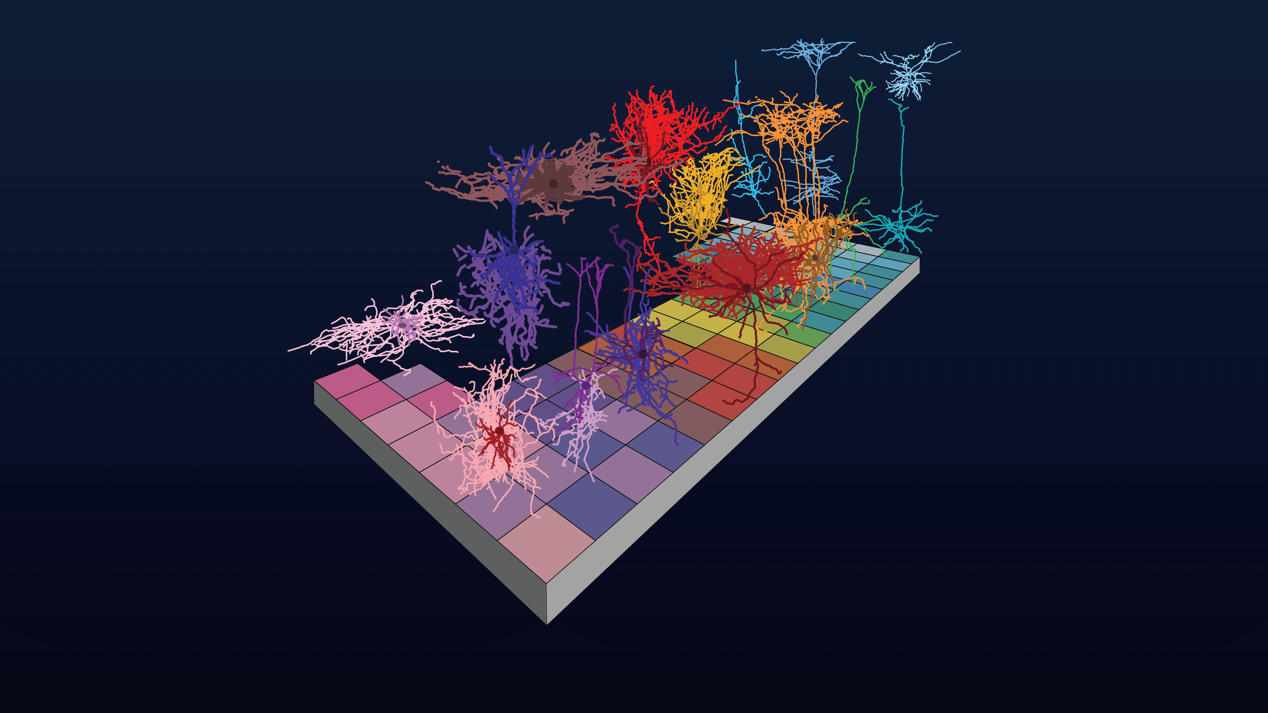
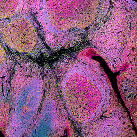
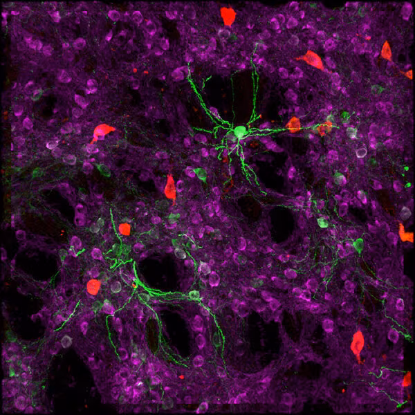
Here at the Allen Institute, many of the UMAPs we share as a part of our open science mission represent transcriptomic data. In other words, these graphs help us to compare gene expression between cells.
What is transcriptomic data?
Transcriptomic data is a type of data that allows scientists to investigate which genes a cell is transcribing/expressing and in what quantities. If a cell, and more specifically, that cell’s nucleus, contains a specific RNA transcript, this indicates that the cell is expressing the specific gene associated with that RNA. By (1) isolating nuclei, (2) sequencing the mRNA transcripts found within the nuclei, and (3) counting those transcripts, we can tell which genes the cell is expressing and how much these cells are expressing these genes. Repeating this process for thousands of cells from a sample of brain tissue allows researchers to find similarities and dissimilarities between cells on the basis of their gene expression. These patterns of similarity and dissimilarity are then used to classify certain cells as specific “types.” The graphic below explains in detail how scientists gather transcriptomic data and represent it via a UMAP.
Now that we know what UMAPs represent, we can discuss how they are constructed.
How is a UMAP constructed?

How can you analyze a UMAP?
Now that we know what UMAPs represent, we can discuss how to analyze them.
Several of the Allen Institute’s open datasets allow you to filter, color-code, or alter UMAPs in order to make analyzing them easier.
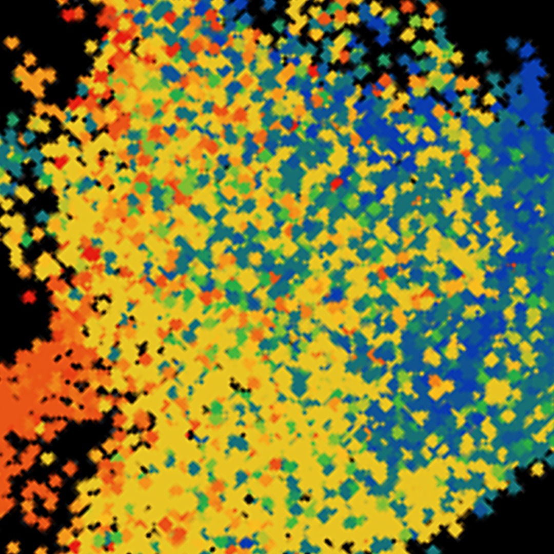
Here is one example of how you can analyze a UMAP by applying colored filters based on a particular characteristic of the cell, such as gene expression. In the figure featured below, you can see which cells expressed “gene 1” and in what quantity.