

charting a brand revolution
the building blocks of our brand
the lens/
The lens icon celebrates all our scientific endeavors and represents how our work brings things into focus; it encourages a deeper look into science, connection, and discovery. Uncoupled from a specific color, it reinforces our flexible visible language and takes on design attributes of the content it supports or highlights.
the slash/
The slash component of our new icon represents momentum and progress. Applied throughout our website and materials, it denotes relationship, not rank. Our work and teams are interconnected and interdependent, moving forward together toward the same goal.
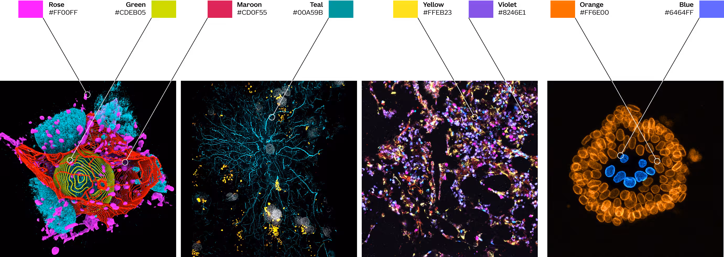
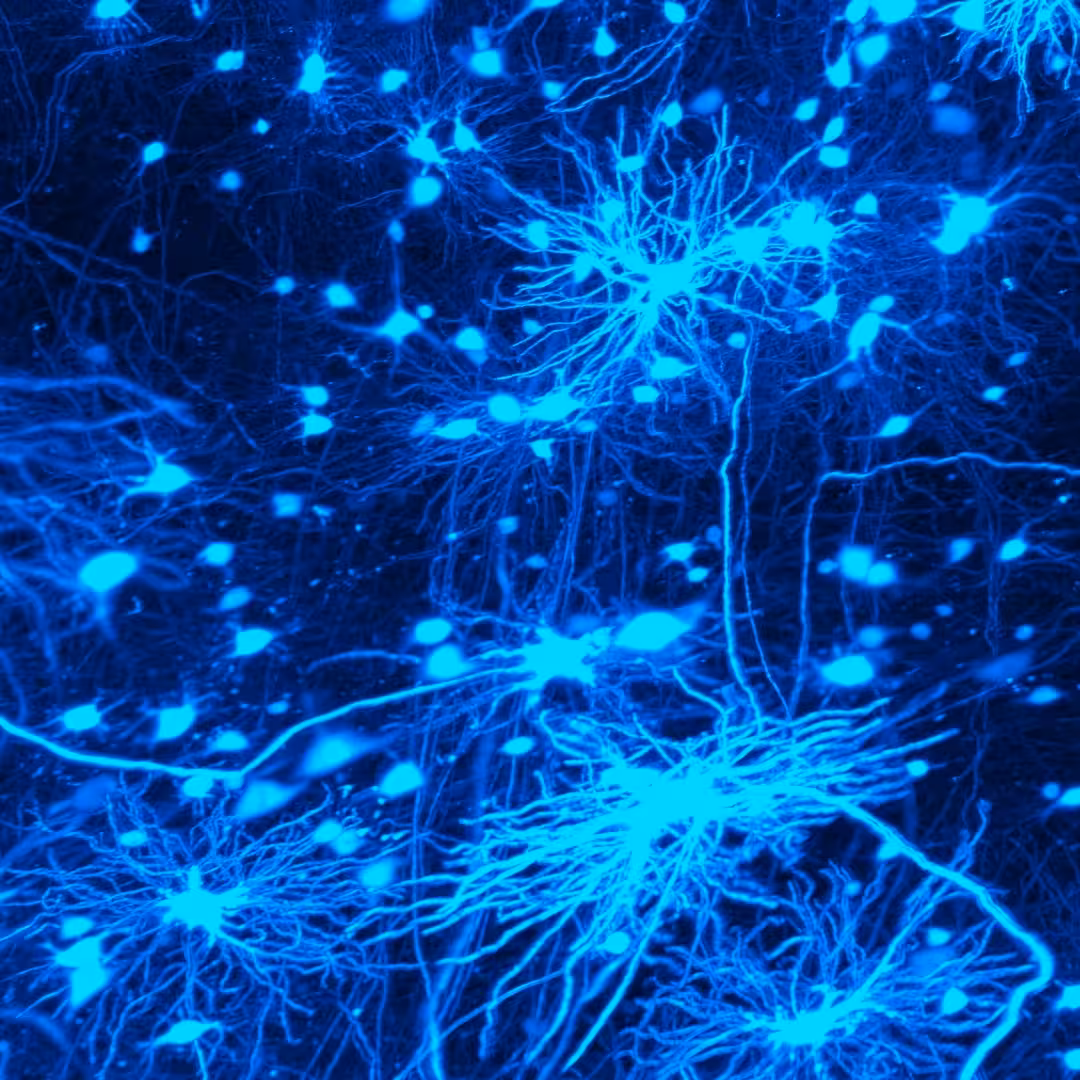
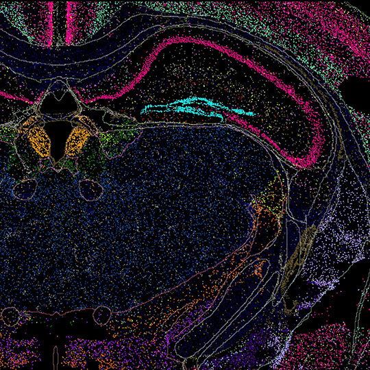
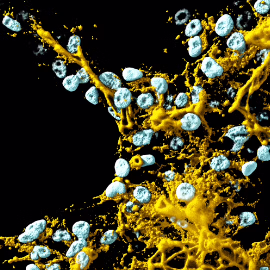
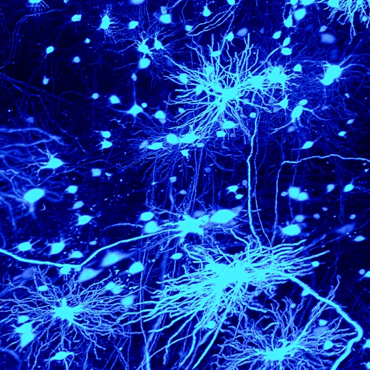
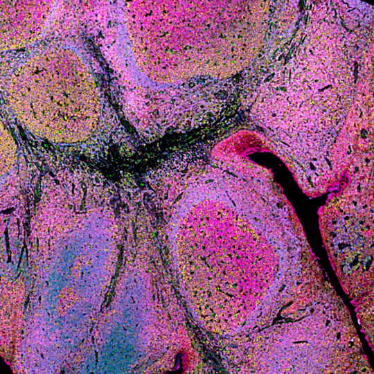
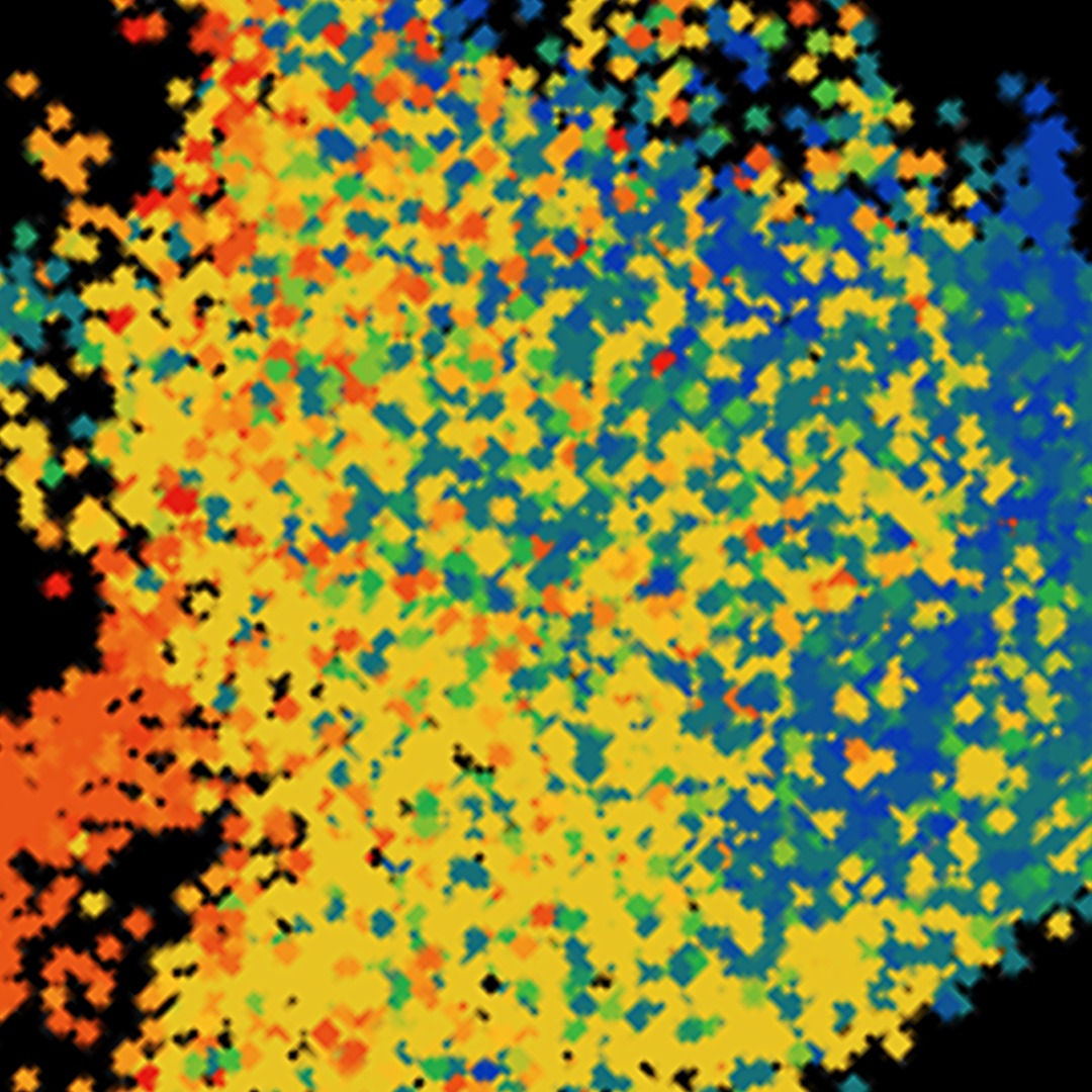
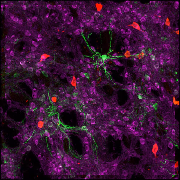
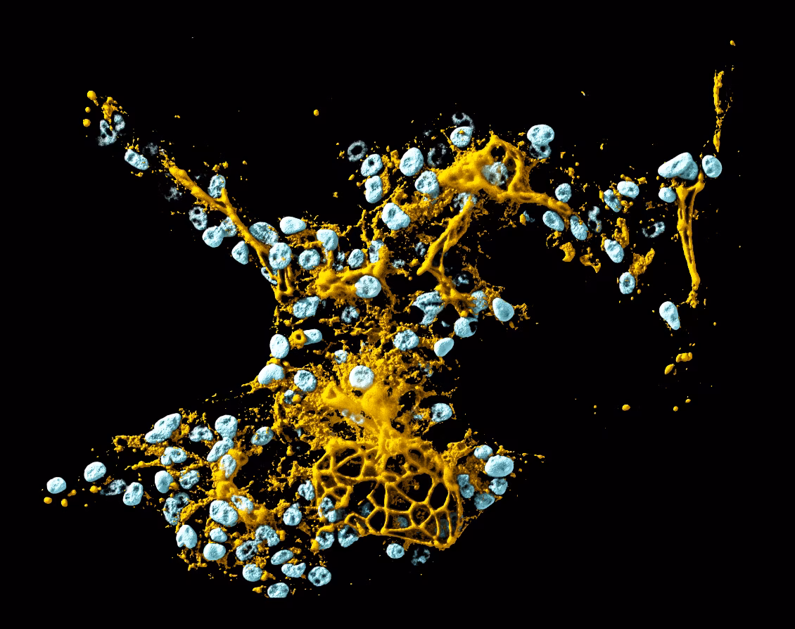
the colors
A departure from the predictable blues, grays, and whites of our industry, we invite excitement and engagement with colors inspired directly from our science.

the font
Our custom typeface brings personality and approachability to scientific communication. While crafting it, the designers gave special attention to the lines, weight, symmetry and spacing of each character to ensure maximum legibility. It embodies our belief that transformative research should feel accessible, because our impact is felt far beyond the lab.

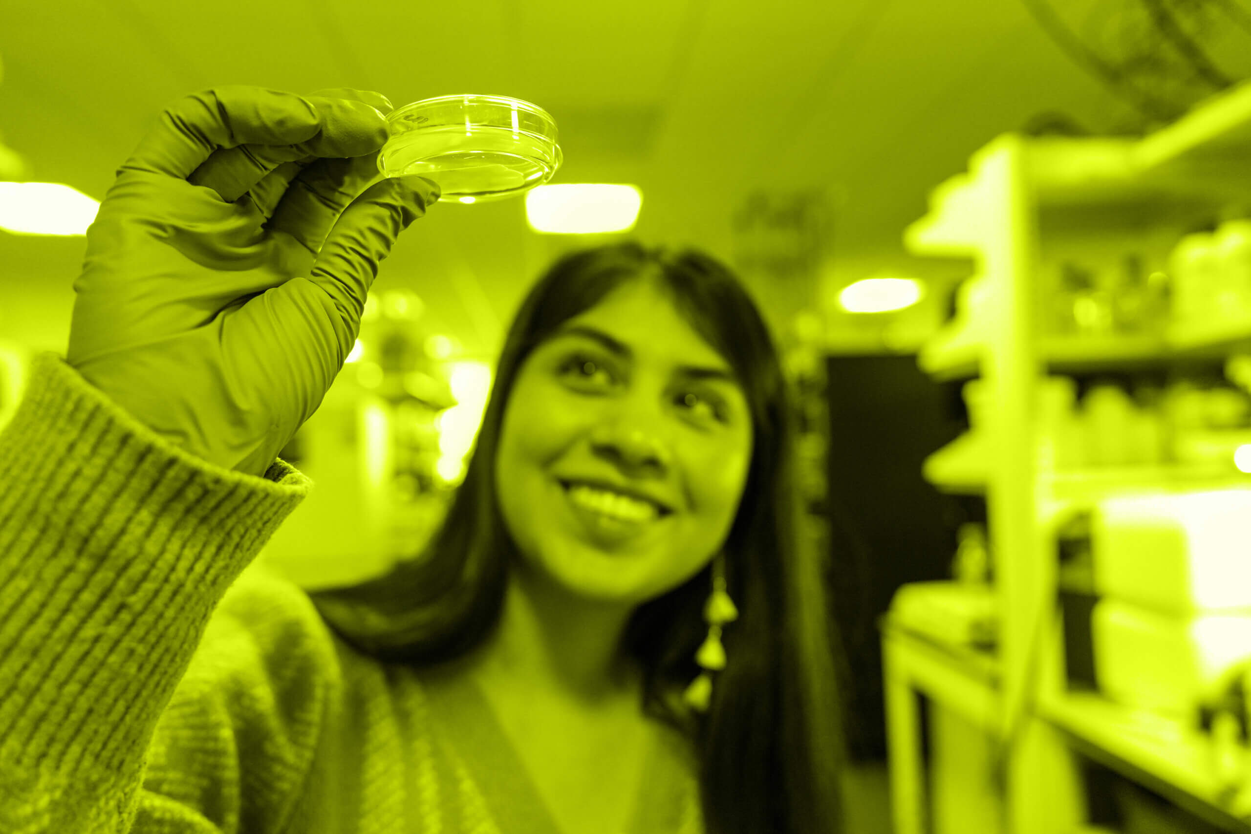
we are one allen institute
And our mission remains the same: to advance our understanding of life with ambitious, open projects that shift what’s possible and fuel new treatment and therapies for disease. We’re committed to accelerating science to move entire fields forward for a healthier world.